The Life-or-Death Color Code
Walk into any American convenience store and you're hit with a kaleidoscope of liquid colors: Coca-Cola's caramel brown, Pepsi's cola darkness, Mountain Dew's electric yellow-green, and dozens of other precisely calibrated hues. But this rainbow didn't start in a marketing boardroom—it began behind pharmacy counters in the late 1800s, where the wrong color could literally mean the difference between life and death.
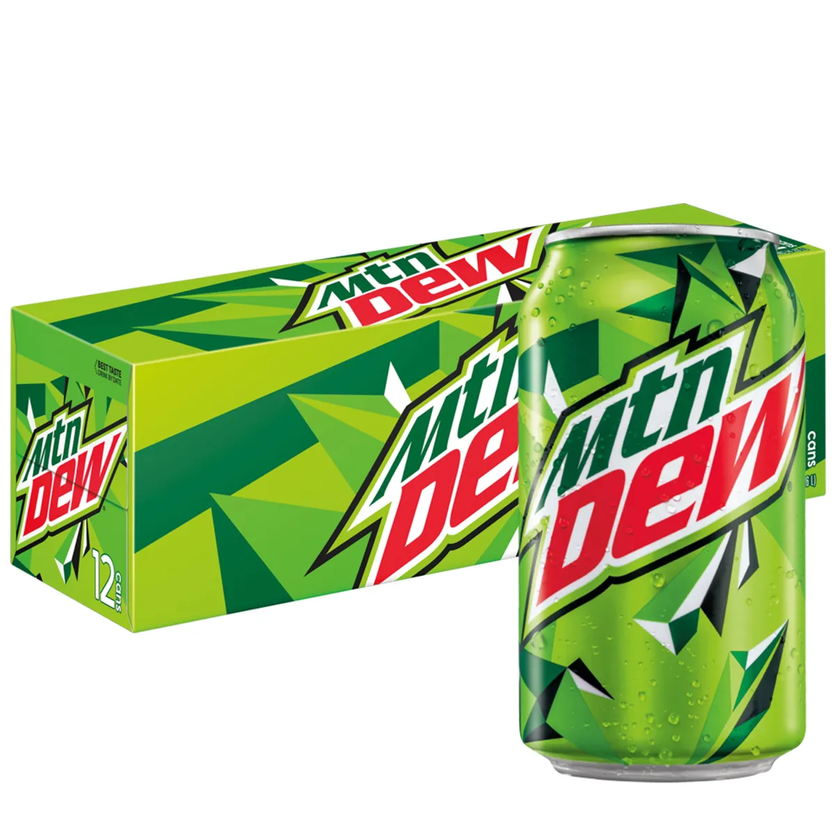 Photo: Mountain Dew, via i5.walmartimages.com
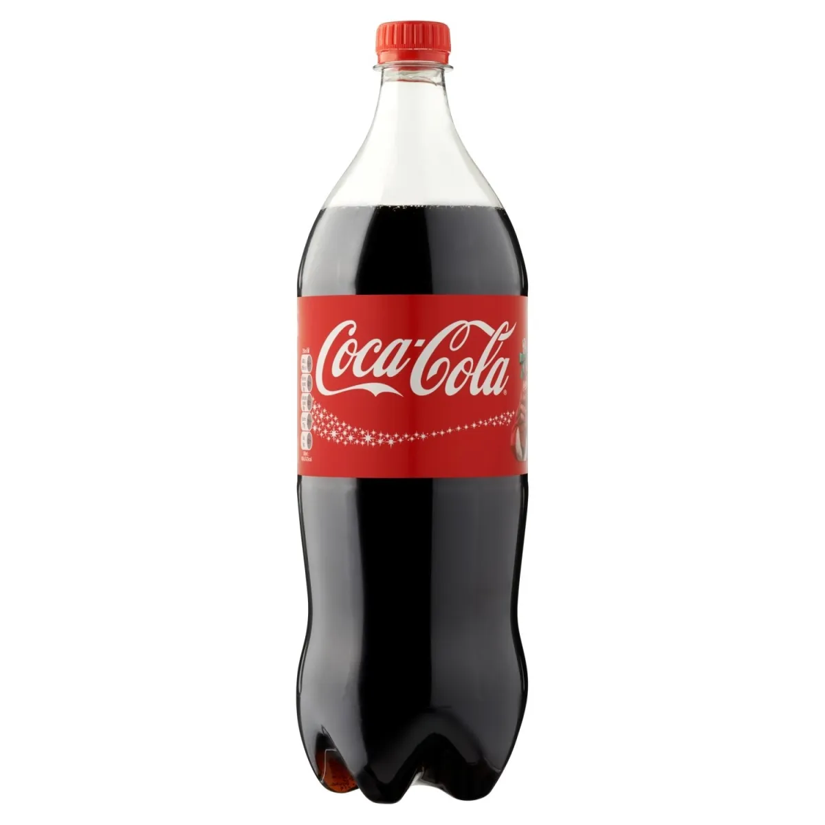 Photo: Coca-Cola, via floripafooddelivery.com.br
Before modern labeling and safety regulations, pharmacists relied on a sophisticated color-coding system to distinguish between different medicines and indicate their safety levels. A clear liquid might be harmless saline solution or deadly poison. The color was often the only quick way to tell the difference.
When Soda Fountains Were Actually Fountains of Medicine
Here's what most people don't realize: the first soda fountains weren't treats for kids—they were medical dispensaries for adults. Pharmacists mixed carbonated water with various medicinal syrups, creating effervescent drinks that were supposed to cure everything from headaches to "nervous disorders."
Dr. John Stith Pemberton, who invented Coca-Cola in 1886, wasn't trying to create a refreshing beverage. He was developing what he called a "brain tonic" to treat headaches and fatigue. The distinctive caramel color came from the burnt sugar used in the medicinal syrup, which pharmacists had long associated with digestive remedies.
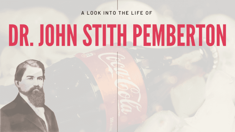 Photo: Dr. John Stith Pemberton, via atouchofbusiness.com
Similarly, root beer's dark brown color mimicked the appearance of traditional herbal tonics, while clear sodas like 7UP (originally called "Bib-Label Lithiated Lemon-Lime Soda") were designed to look like purified medicinal waters.
The Accidental Psychology of Liquid Trust
The pharmacy color-coding system did something unexpected: it trained American consumers to associate specific colors with specific effects and levels of safety. Brown and dark liquids suggested strength and potency—think cough syrup or digestive bitters. Clear liquids implied purity and gentleness. Bright colors signaled flavored treatments that were safe for regular consumption.
When soft drinks transitioned from medicine to recreation in the early 1900s, they carried this color psychology with them. Consumers had been unconsciously conditioned to trust certain colors and expect certain experiences from them.
This wasn't intentional marketing genius—it was an accidental byproduct of medical necessity. But it worked so well that it became the foundation of modern beverage branding.
The Hospital Mistake That Changed Everything
The real breakthrough came from a pharmacy error that could have been tragic but instead revolutionized the industry. In 1903, a hospital pharmacist in Chicago accidentally mixed up two clear medicinal syrups—one harmless, one potentially dangerous. The mistake was caught before anyone was hurt, but it sparked a nationwide push for better visual identification systems in medical facilities.
Pharmacists began adding more distinctive colors to their preparations, not for aesthetics but for safety. They discovered that patients were more likely to take their medicine when it had a pleasant color, and they were more likely to remember which medicine was which.
This hospital near-miss led to the development of standardized color codes that spread beyond pharmacies into the emerging soft drink industry. Manufacturers realized they could use these established color associations to communicate flavor and safety to consumers without saying a word.
How Medical Colors Became Marketing Gold
By the 1920s, soft drink companies had figured out that color was their most powerful marketing tool. They weren't just making drinks—they were creating visual brands that could be recognized from across a room.
Coca-Cola's caramel brown became so iconic that the company fought legal battles to prevent competitors from using similar shades. Pepsi-Cola initially tried to differentiate itself with a lighter color before eventually embracing its own version of cola darkness.
Orange sodas like Fanta and Orange Crush used colors so vivid they barely resembled actual oranges, but they triggered the same psychological response that pharmacists had discovered with flavored children's medicines: bright, appealing colors suggested fun, safe consumption.
The Science Behind the Rainbow
Modern beverage companies have turned color psychology into a precise science. They employ color specialists who understand exactly how different hues affect taste perception, purchasing decisions, and brand loyalty.
Red suggests energy and excitement—think Coca-Cola and Dr Pepper. Green implies natural and refreshing—Mountain Dew and Sprite. Clear suggests purity and cleanliness—7UP and Sprite. These aren't random choices; they're based on decades of research that traces back to those original pharmacy color codes.
Food scientists have discovered that people literally taste flavors differently based on the color of the liquid. A strawberry-flavored drink tastes more "strawberry-like" when it's red, even if the actual flavor is identical to a clear version.
The Lasting Legacy of Liquid Safety
Today's $200 billion American beverage industry still operates on principles established by 19th-century pharmacists who were just trying to keep their patients safe. Every time you grab a Coke instead of a Sprite, or choose Mountain Dew over root beer, you're responding to visual cues that were originally designed to prevent medical accidents.
The irony is perfect: what started as a system to help people identify potentially dangerous medicines became the foundation for marketing some of America's most beloved (and arguably least healthy) consumer products.
Next time you're staring at the dizzying array of colored liquids in a convenience store cooler, remember that you're looking at the descendants of a medical safety system. Those colors aren't just pretty—they're speaking to you in a visual language that's been over a century in the making, whispering promises of flavor, refreshment, and safety that trace back to a time when your soda fountain operator wore a white coat and called himself "Doctor."